How to attract regional customers – A conversion guide for tour and activity providers
Tips & Advice
You want to attract customers from the region with your experience and improve your local marketing, but you don’t know how? In addition to offline advertising, social media and online travel agencies (OTAs), one important point for your local success strategy is often neglected – your website. On your website, interested visitors can find all the important details about your company and your products.
That’s why a professional website is one of your most important tools to convince potential customers to book your offers directly and make them pay customers. The better your website is designed for this, the more likely it is that this conversion will take place. What exactly you have to do and how an optimal conversion path looks like, you will learn in this article.
What is website conversion?
Website conversion is ultimately about encouraging an interested website visitor to perform a certain action. There are numerous examples of this. It all depends on what exactly your goal is. Do you want to increase the number of your newsletter subscribers? Do you want to share your blog posts on social networks? Of course, the classic conversion goal is for your website visitors to buy your product.
By monitoring your conversions, you can determine exactly how well the structure of your website matches your goals. Because with a good user interface, where design, structure and content are consistent, you will achieve a high conversion rate. In this way, you will turn visitors into paying customers.
At the same time, you can improve your website to address exactly your desired target group. In this way you can be sure that you also advance your local marketing and reach customers from the region.
Improve your conversion path
First impressions count, and this saying is especially true when it comes to your website. The very moment you open your website, potential customers will decide whether they get the right impression of you and your offer. By providing a structured user experience, you make sure that they get the most relevant information first and can book your offer easily.
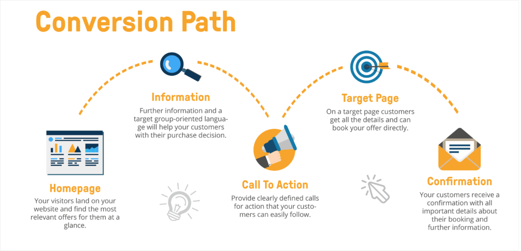
You always decide which way the visitors take on your website. If you work with a cleverly structured conversion path, your customers will find what they were looking for faster. You also make your customers more likely to perform the actions you want them to perform. A classic conversion path looks like this:
- Your customers discover an interesting offer on your site
- They will find additional, relevant information that will encourage them to buy.
- A direct call to action (CTA, for example “Book now”) leads them to a
- Target page where they can book your experience or perform another action.
- Afterwards they will receive a direct confirmation with further details.
Conversion right from the start
Concentrate on your home page first. Because most of your visitors end up there first. At first glance, it should be clear what you are and what services you offer. Present your most exciting tours or activities directly on the homepage and add all useful information such as price, duration or rating. This way your visitors don’t have to click through your website to find the most important offers.
Conversion via Call to Actions
Each of your products presented in this way should have a unique Call to Action (CTA) that directs users to the appropriate product page. With the Global Widget from bookingkit you can for example insert a CTA on any of your pages. In our example from Frankfurt Secrets, it is even located in the navigation bar and allows your customers short distances for their buying experience.
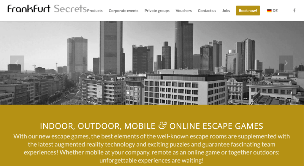
As soon as they click on the CTA button and land on the respective page, it is all about describing your tour or activity in detail. This tells your customers exactly what to expect from your experience and helps them make a well-considered purchase decision.
Eye-catching conversion
Especially visual content like pictures or videos increase the fascination of your customers for your leisure activities. Try to create as many of them as possible yourself. If you are just starting your business, you will certainly start with stock photos or other photo databases. But to stand out from other providers and to give real impressions of your experience, sooner or later there is no way around working with your own material.
Less is sometimes more
This does not only apply to visual content. Too much text at a glance distracts your online visitors from what they were looking for. They want to quickly find exciting offers and, in the best case, be able to compare them at a glance. Avoid too long texts and concentrate on the essential sales arguments for your tour or activity. This way you make sure that really all important information is read. Of course, there is nothing to be said against going into more detail on the respective product pages.
The purchase, make it easy
You have designed your website clearly and your customers could find all important details? Ideally they have now landed on your booking page via call-to-action and buy your product. The most important point here is: Make the purchase process as easy as possible for your customers. In addition to an easy-to-understand booking procedure, the offer of different payment methods is a decisive factor for the success of your conversion. Because each of your customers has a preferred payment method. You can find more information here.
The finale of a good conversion path
A perfect ending for your conversion path is the confirmation email. Send a summary of the booking and all necessary details such as date and time. Use this After-Sales-Email to point out further actions and to give your customers the possibility to contact you directly. This gives them the security to have made the right decision with you and your offer.
Conversion and local marketing – get it combined
But how exactly does the conversion path help you with your local marketing? First take a closer look at your offers.
- Highlight exactly those products that appeal to a local audience. Whether it’s bachelor parties, wedding offers, birthday promotions or special discounts for couples, there are many ways to tailor your tours and activities to customers who want to experience something in their region and yours at the same time. You may have noticed in the past that certain offers are more interesting for those who are close to you.
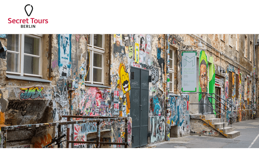
A good example is provided by “Secret Tours Berlin“. This bookingkit customer offers special city tours that are exciting for Berliners as well as for tour enthusiasts from all over the world and presents them prominently on the homepage. Because even as a resident of the capital, you suddenly get to know it from a completely new perspective.
- But you don’t have to fundamentally reinvent your offerings. Just by changing the description of your product you can achieve a lot.
- Additionally emphasize on your website to whom exactly you are addressing. Address your local customers directly. For example, you can highlight your location or the proximity of other attractions in your area.
These are just a few examples of how you can achieve a better conversion path for a local audience. Conversions is an ongoing process where you can constantly redefine, test and optimize all the points of contact that a visitor has with your website. Try out which path is right for you.
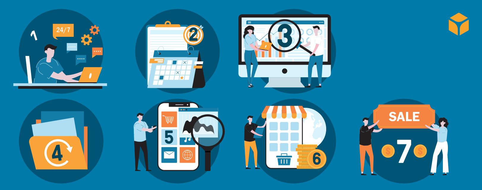
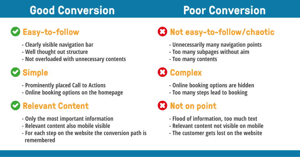
This overview gives you the opportunity to check if your website is currently geared towards conversions and to see where you can improve:
Want to learn more about how bookingkit can help you drive conversions and get more bookings on your website? Then get your free demo now.


